Creating Data Visualizations with D3 and ReactJS
In this tutorial, we are going to create three different simple visualizations with D3 in React.

Table of Contents
D3 is a lot more than just a graphing library, it’s a toolset for efficiently editing the DOM and creating visualizations based on data.
If all you want is to quickly insert a generic bar graph into your app, then D3 is probably not for you, but if you want the ability to customize your visualizations from the ground up, then D3 is the industry standard.
In this tutorial, we are going to create three different simple visualizations with D3 in React.
Now while these things can be done without D3 and aren’t particularly flashy, they highlight some of the basics of D3 very well. If you want to see some cool demos to get a sense of just how powerful D3 is, then check out some of the demos on the D3.js home page.
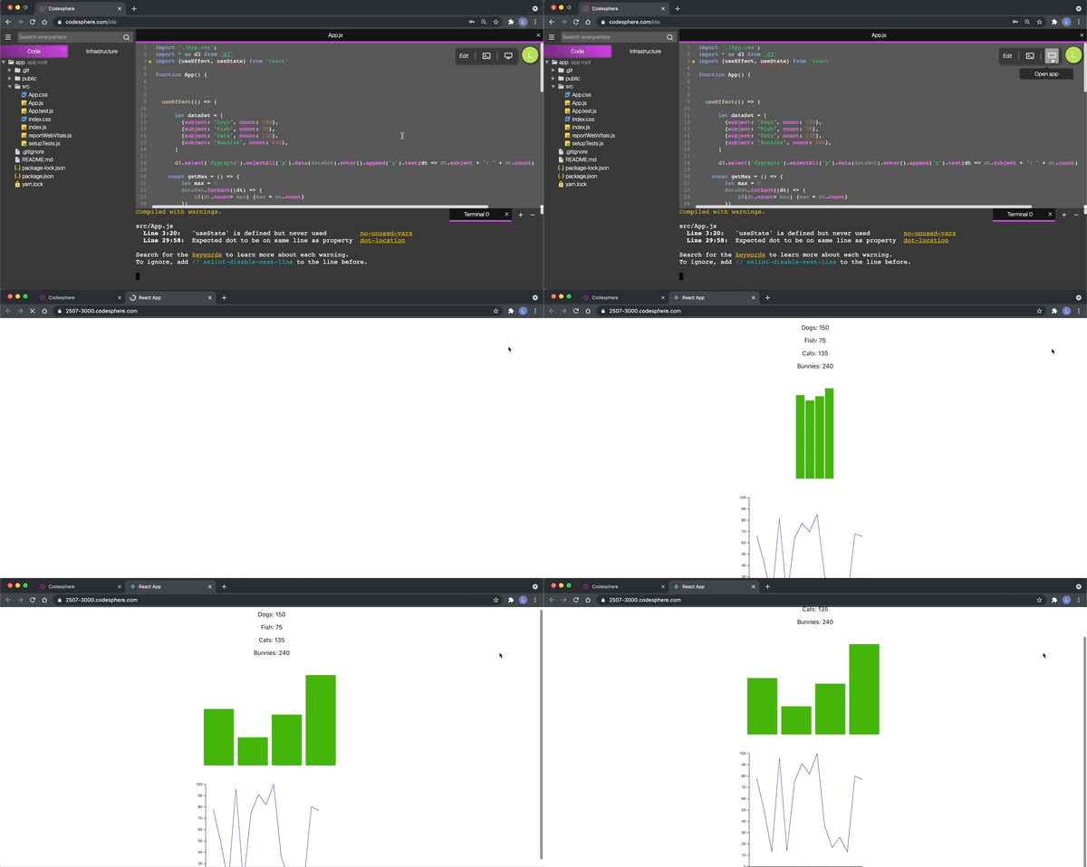
To see the three visualizations that we are going to make, you can open up this project in Codesphere, a free development environment with instant deployment features. Just click the link, sign in, and run:
npm ci && npm start
http://codesphere.com/#https://github.com/LiorB-D/d3tutorial
Setting up React
Let’s start off with a blank Create-React-App.
If you are new to React, this can be made with:
npx create-react-app my-app
We are also going to need to install D3 onto our app, with:
npm install d3
Don’t forget to import D3 in all the files you are using it in!
import * as d3 from ‘d3’
For now, we are going to render an empty div and create a useEffect hook, in which we will later insert all of our D3 code:
Creating Labels Dynamically
The first thing we are going to do is use D3 to dynamically insert p tags based on data. While this of course is not too difficult to do with vanilla React, I would recommend for anyone learning D3 to get comfortable editing the DOM in this way.
Let’s go through each part of that D3 line on line 17 and breakdown what it does:
- d3.select(“#pgraphs”) selects the div with the id “pgraphs”
- .selectAll(‘p’) tells d3 that we want to look at the p tags within that div. Since there are currently no p tags, we will need to create them later.
- .data(dataSet) binds that dataSet array to these p tags
- .enter().append(‘p’) adds all missing p tags within the div such that there is one p tag for each element in the bound dataset
- .text(dt => dt.subject + “: ” + dt.count) sets the text of each of these p tags based on an arrow function we are defining within the text() function. Here, we want to take each corresponding element in the dataSet array and create a string based on the subject and count.
Creating An Animated Html-Based Bar Graph
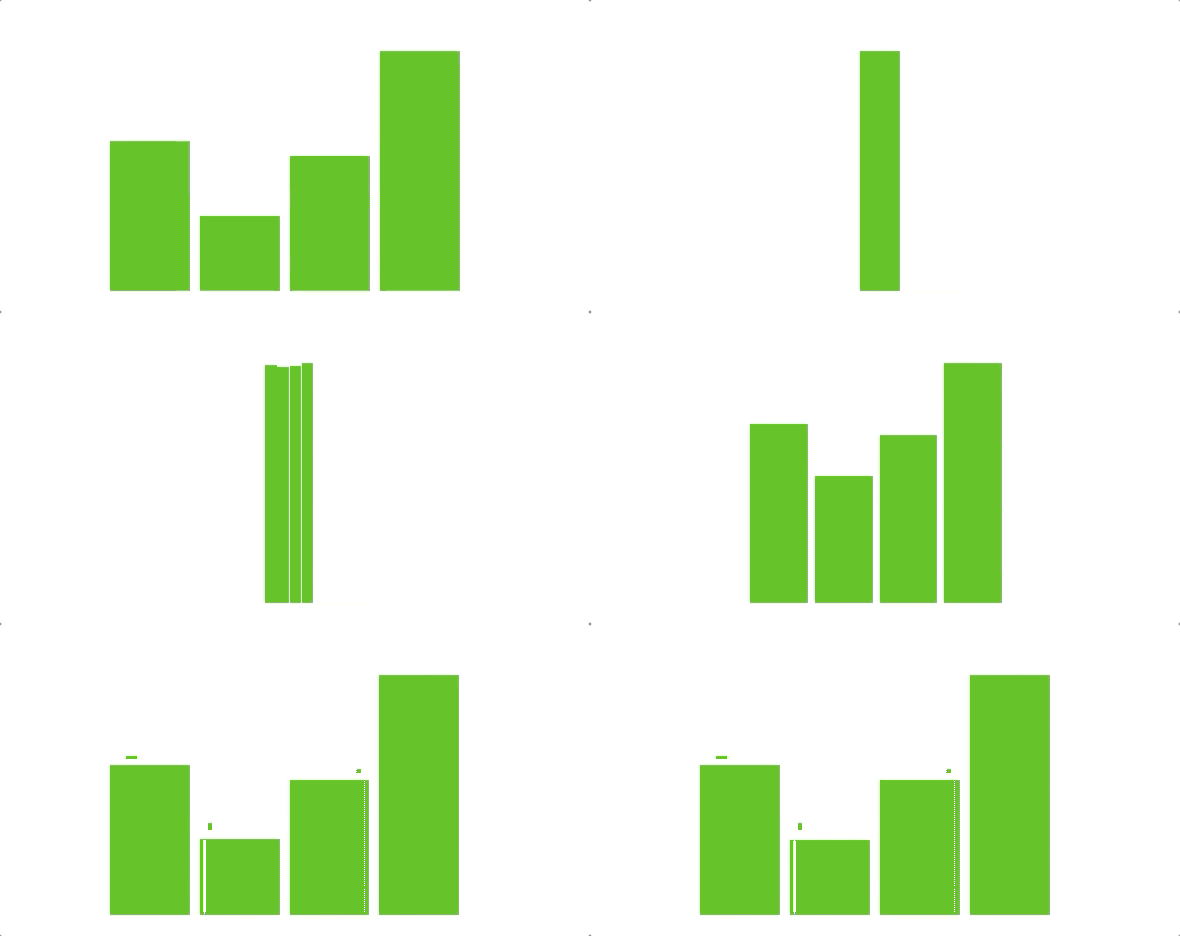
Next, we are going to create a custom Bar Graph based on this data by creating a div for each element and dynamically setting the height.
In our App.css, we are going to add two styles: One for the div containing the bar graph, and one for each individual bar.
Now in our useEffect we are going to have D3 do the following animation.
- Set each bar to have the same height (Which will be equal to the highest count value)
- Wait 300 milliseconds
- Set each bar’s height to correspond with a count value.
- Transition the bars into having a margin and a larger width.
Let’s go through these new D3 functions that we just used:
- .classed(‘bar’, true) gives all the selected elements the CSS class “bar”
- .style(style, value) gives all the selected elements a given CSS style with a given value
- .transition() tells d3 to transition the element into the changes that will be made
- .duration(ms) dictates the duration of the transition in milliseconds
- .delay(ms) delays all the previous changes by a certain amount of milliseconds
If all is working well, the animation should look like this:

Creating An SVG-based Line Graph
While in the previous two examples, we used HTML elements, if you want much more versatility you are going to want to use D3 to manipulate SVG elements.
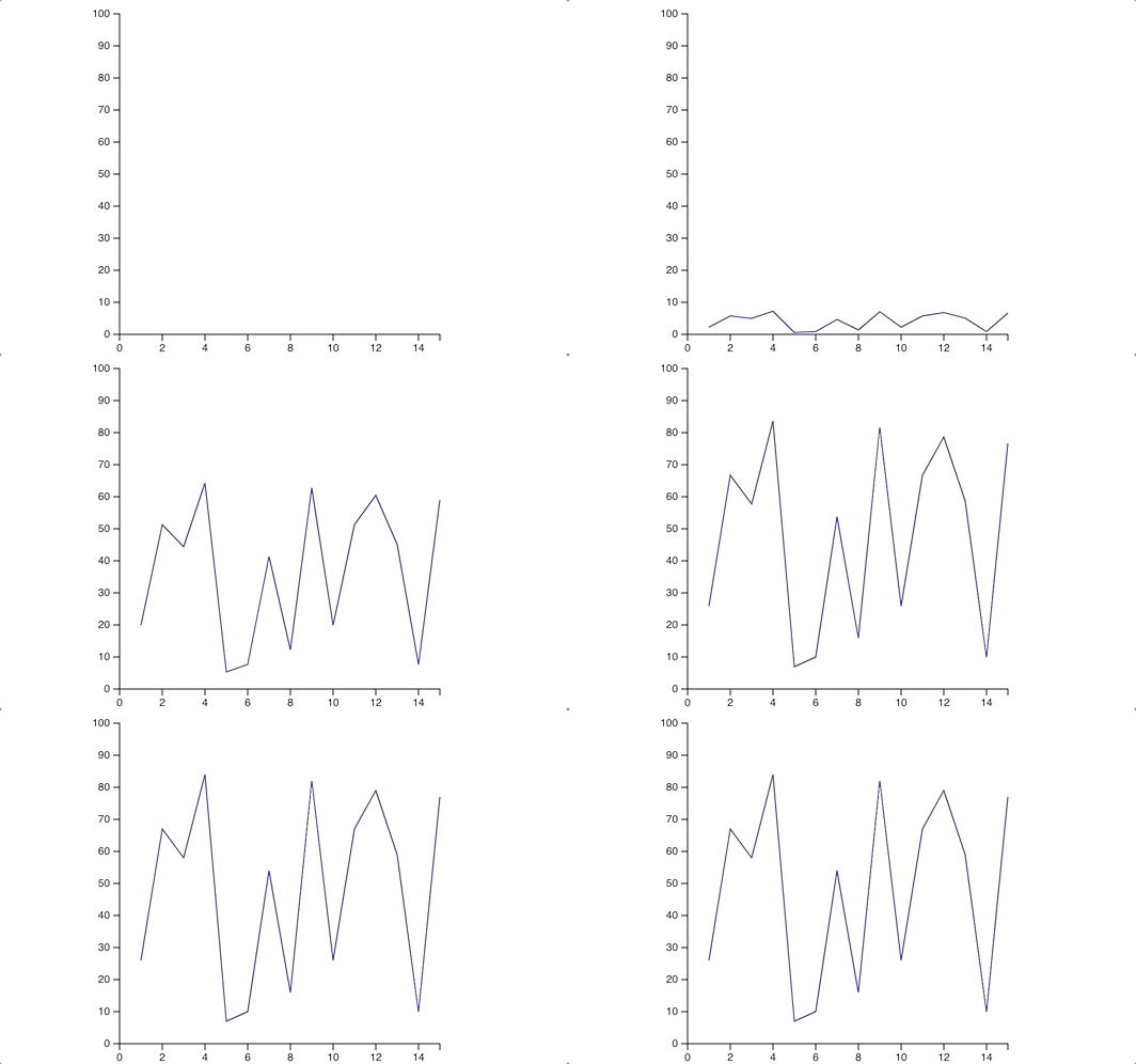
For our line graph, we are going to create X and Y axes as well as a nice animation. For this example, we are also going to generate a random dataSet so that we have more points to work with.
First, let’s add the following style to our App.css
We are then going to use D3 to do the following:
- Create D3 scales, which will allow us to easily map our data values to pixel values in our SVG.
- Define a path with scaled x and y coordinates
- Create x and y-axis based on our scales
- Graph a straight horizontal line at y = 0 in the #LineChart SVG
- Transition that line into having the correct y values based on our data
- Append our axis to our SVG
Note that with functions like d3.line(), d3.axisBottom() and d3.scaleLinear(), D3 is giving us tools for processes that are possible in vanilla javascript. Even though D3 is built to allow you to make your visualizations from the ground up, it offers a host of different functions like this.
If all is working well, you should see the following Line Chart:

Conclusion
Again, this is only the bare bones of what is possible with D3. D3’s versatility and in-house toolset mean that the only limit to the beautiful visualizations you create is your imagination!
Thanks for reading!

