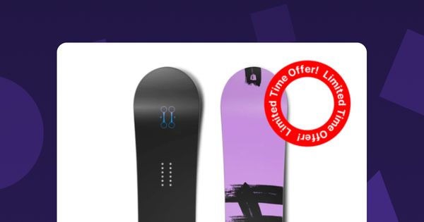
Interactive E-Com UI Tutorial: Rotating Sale Indicator
Learn how to create an animated rotating sales sign in Shopify Hydrogen using framer-motion. Engage users with visually appealing animations and boost conversions on your e-commerce website.

Introduction
In the fast-paced world of e-commerce, engaging users with interactive and visually appealing elements is crucial. Animations play a significant role in capturing the user's attention and influencing their behavior. In this article, we will be adding o a rotating sales sign to a Shopify Hydrogen store, that dynamically animates a sales offer on your website. We will leverage the power of the framer-motion library to achieve the animation effect.
Setting the Stage
When implementing new features or animations, the goal is to influence user behavior. One effective way to achieve this is by tapping into human behavior patterns.
For this animation, we had the following pattern in mind:
Breaking Rules
Breaking established norms and patterns can capture attention effectively. When something deviates from the expected or challenges familiar conventions, it immediately grabs the user's interest and attention. By introducing unexpected and unconventional elements in your design, you can pique curiosity and draw focus to specific areas.
You can see this effect come into play in this example:
Just as in out last articles we would use those behavior patterns to form an educated hypothesis for testing the new component.
But now, let's get coding!
Getting Started
Before we dive into the implementation, let's understand the goal and the technology stack we'll be using.
Goal
The main objective of our rotating sales sign is to attract users and encourage them to explore the available offers on your e-commerce website. By creating an eye-catching animation, we aim to pique the user's curiosity and motivate them to take action.
Technology Stack
To achieve our goal, we will utilize the following technologies:
- Shopify Hydrogen: Shopifys headless framework utilizing React
framer-motion: A library that provides a set of easy-to-use motion components for creating animations in React.
Implementing the RotatingSaleSign Component
Let's start implementing our RotatingSaleSign component step by step.
Step 1: Defining the Props Interface
Before diving into the component implementation, let's define the interface for the component props. This interface helps ensure that the correct props are passed to the component and provides type safety within our codebase.
interface RotatingSaleSignProps {
  cardLabel: string | undefined;
}
In this code snippet, we define an interface called RotatingSaleSignProps, which specifies the props expected by the RotatingSaleSign component. The interface has a single prop called cardLabel, which represents the label for the sales sign. The prop is of type string | undefined.
Step 2: Creating the RotatingSaleSign Component
Now, let's create the RotatingSaleSign component. This component will render the rotating sales sign based on the provided cardLabel prop.
export function RotatingSaleSign({ cardLabel }: RotatingSaleSignProps) {
  return (
    cardLabel === 'Sale' && (
      <motion.div
        className="absolute top-0 right-0 m-4 text-right text-notice"
        style={{
          width: 80,
          height: 80,
        }}
        animate={{ rotate: 360 }}
        transition={{
          duration: 15,
          repeat: Infinity,
          ease: "linear",
        }}
      >
        <img src={saleImage} alt="sale" /> {/* Use the img element here */}
      </motion.div>
    )
  );
}
In this code snippet, we define the RotatingSaleSign component as a functional component. It receives the RotatingSaleSignProps object as its parameter, which is destructured to extract the cardLabel prop.
The component uses conditional rendering to determine whether to display the rotating sales sign. If the cardLabel is equal to 'Sale', the component renders a <motion.div> element from the framer-motion library. This <motion.div> represents the container for the rotating sales sign.
Inside the <motion.div>, we define the styling for the container using the style prop. The container has a fixed width and height of 80 pixels.
The animation is achieved using the animate and transition props provided by framer-motion. We set the animate prop to { rotate: 360 }, which rotates the sales sign continuously by 360 degrees. The transition prop defines the duration of the animation, the number of times it repeats (Infinity for infinite looping), and the easing function to use.
Finally, we include an <img> element inside the <motion.div>. This <img> represents the sales sign image to be displayed. Make sure to provide the appropriate src and alt attributes for the image.
Step 3: Exporting the RotatingSaleSign Component
To make the RotatingSaleSign component accessible to other parts of our application, we export it using the export keyword.
export default RotatingSaleSign;
This allows us to import and use the RotatingSaleSign component in other files within our project.
Implementing the Component
We can the use our created component to implement it anywhere in out store.
In this case, we're implementing it into the ProductCard.tsx utilizing the existing cardLabel variable to render our sign on top of the product image, only when the product is on sale.
          <div className="card-image aspect-[4/5] bg-primary/5">
            {image && (
              <Image
                className="object-cover w-full fadeIn"
                sizes="(min-width: 64em) 25vw, (min-width: 48em) 30vw, 45vw"
                aspectRatio="4/5"
                data={image}
                alt={image.altText || `Picture of ${product.title}`}
                loading={loading}
              />
            )}
            {cardLabel === 'New' && (
              <Text
                as="label"
                size="fine"
                className="absolute top-0 right-0 m-4 text-right text-notice"
              >
                {cardLabel}
              </Text>
            )}
            <RotatingSaleSign
              cardLabel={cardLabel}
            />
          </div>
Conclusion
That's all for today!
In this article, we explored how to create an animated rotating sales sign in Shopify Hydrogen. By leveraging the power of the framer-motion library, we were able to implement a visually appealing and attention-grabbing animation. The rotating sales sign serves as a powerful tool to engage users and encourage them to explore the available offers on your e-commerce website.
Remember, animations can have a significant impact on user behavior, and implementing interactive elements can lead to increased user engagement and conversions.
Happy coding!

